


 Deutschland
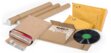
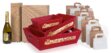
Bedruckte Tragetaschen
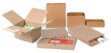
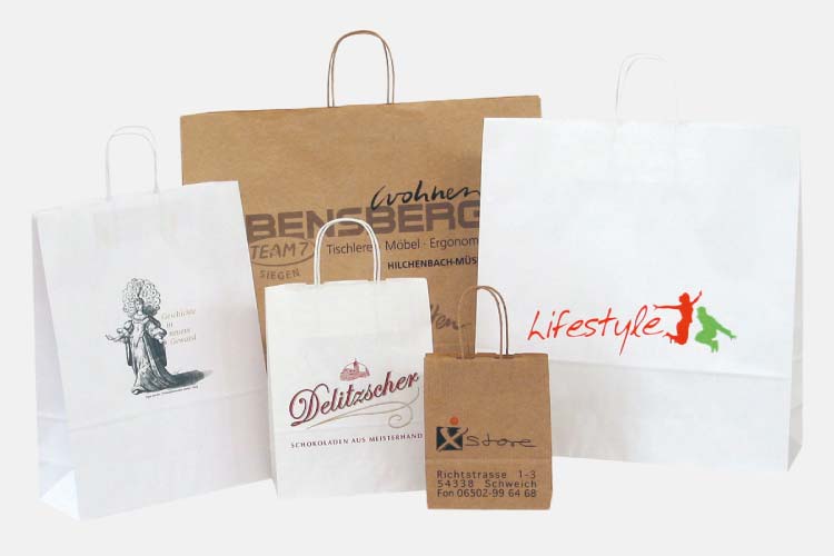
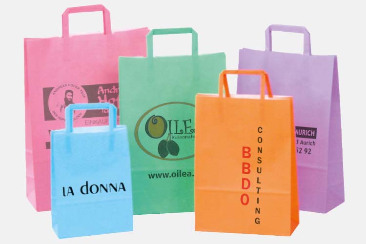
Vielfalt in Format und Material
Ob klein, groß, aus braunem Kraftpapier, weiß oder robustem Recyclingmaterial – unsere Tragetaschen passen sich an Ihre Wünsche an. Unterschiedliche Formate, Boden- und Seitenfalten sorgen für einfaches Aufrichten und komfortables Befüllen. Maßgeschneiderte Formate oder individuelle Drucke – bei uns finden Sie genau das, was Sie brauchen.
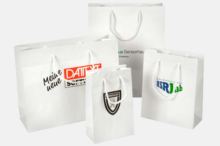
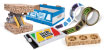
Ihr Logo im Rampenlicht
Wir begleiten Sie von der Idee bis zum fertigen Produkt: Ob 1- oder 2-farbig, Flexo- oder Heißfoliendruck – wir setzen Ihr Logo, Slogan oder Design präzise und hochwertig um. Das sorgt für einen starken Wow-Effekt bei Kunden, im Versand oder auf Events – und Ihre Marke bleibt garantiert im Kopf.
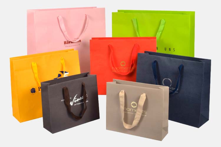
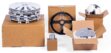
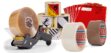
Luxuriös und beeindruckend
Setzen Sie Akzente: Hochwertige Präsenttaschen mit angenehmen Tragegriffen sind Luxus zum Anfassen. Weich und anschmiegsam verleihen sie Ihren Produkten einen stilvollen Auftritt. Außen mit Ihrem Logo bedruckt, entsteht ein hochwertiger Eindruck, der Ihre Marke strahlen lässt.
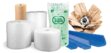
Nachhaltigkeit als Markenbotschaft
Unsere Papiertragetaschen sind zu 100 % recycelbar und auch aus recyceltem Papier erhältlich. So schonen Sie Ressourcen, ohne auf individuelle Optik zu verzichten – Nachhaltigkeit trifft auf starken Markenauftritt.
Individueller Druck? Machen wir möglich
Wir bieten Lösungen, die exakt zu Ihren Vorstellungen passen. Bei uns zählen nicht nur Produktqualität und Preis-Leistungs-Verhältnis, sondern auch der persönliche Service. Profitieren Sie von schneller Umsetzung, flexiblen Stückzahlen und individueller Beratung. Wir machen Ihre Tragetasche zum echten Hingucker.
Kontaktformular